Blissful Dreamscape
Illustrations for ‘I sent my dream to print'.’ color book, created by the Graphic Design Diploma team of RMIT Brunswick University.
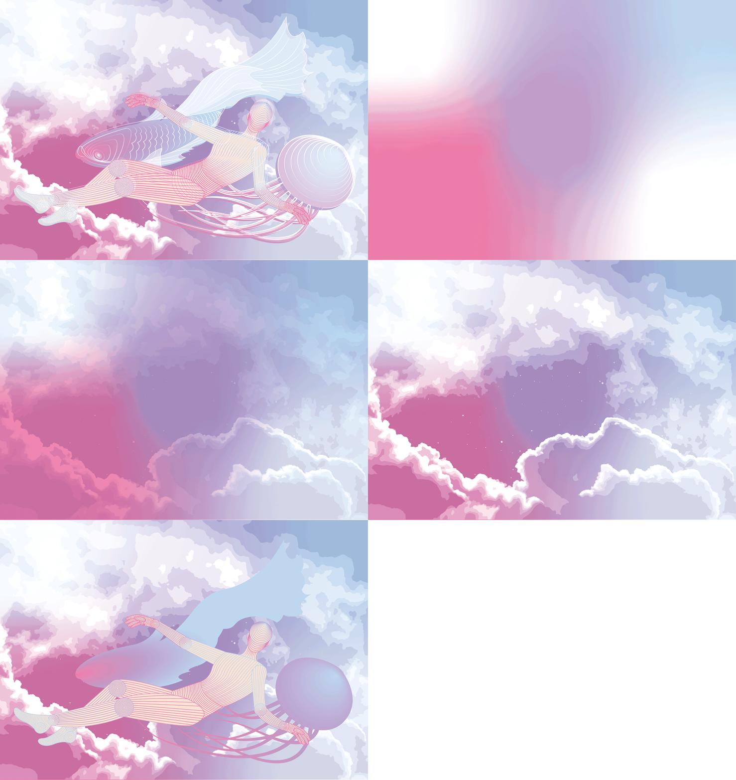
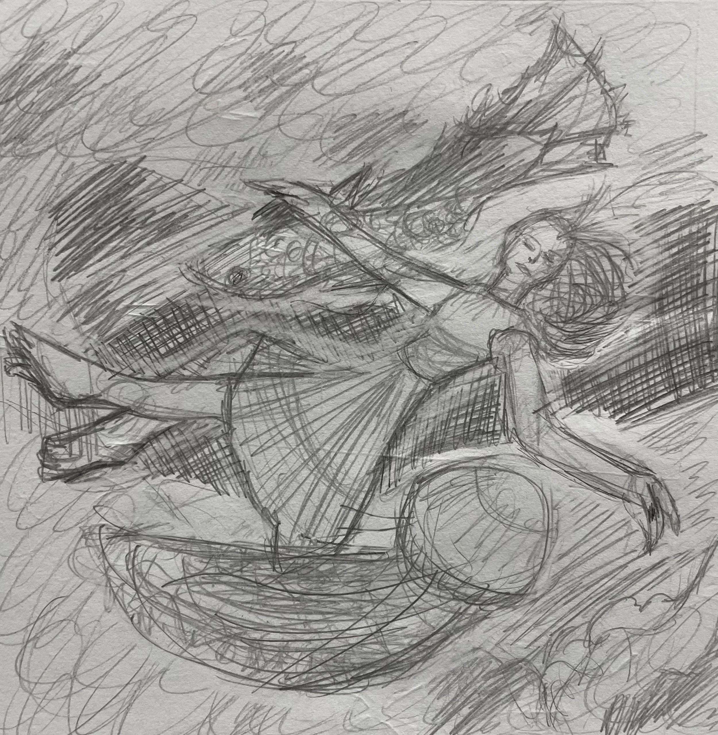
The first illustration is expanded from the Dream Photo Composition project, further developing its originality through more comfortable means of digital imagery techniques (having more expertise in Illustrator than Photoshop), composed of pastel colours, varying lines and soft gradients. There was a lot of experimentation for blending shapes and blending modes to discover various ways to creating mesmerising effects.
The second illustration is an abstract approach to presenting the different Japanese scripts for dream, as a multicoloured kanji 夢 (chinese character), turquoise hiragana ゆめ (for Japanese words), purple katakana ユメ (for non-Japanese words) and blue romaji yume (for romanized Japanese), obscured and reflected for complexity & balance. The background splices are extensions from the strokes of the kanji.
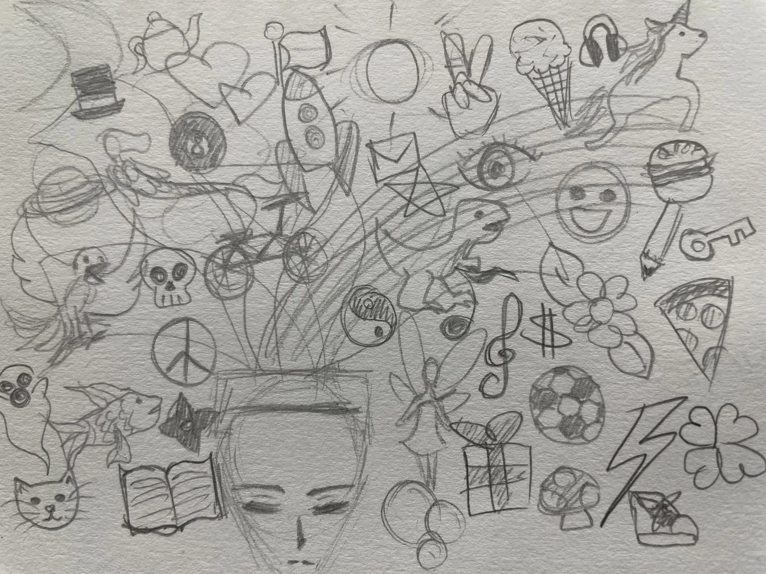
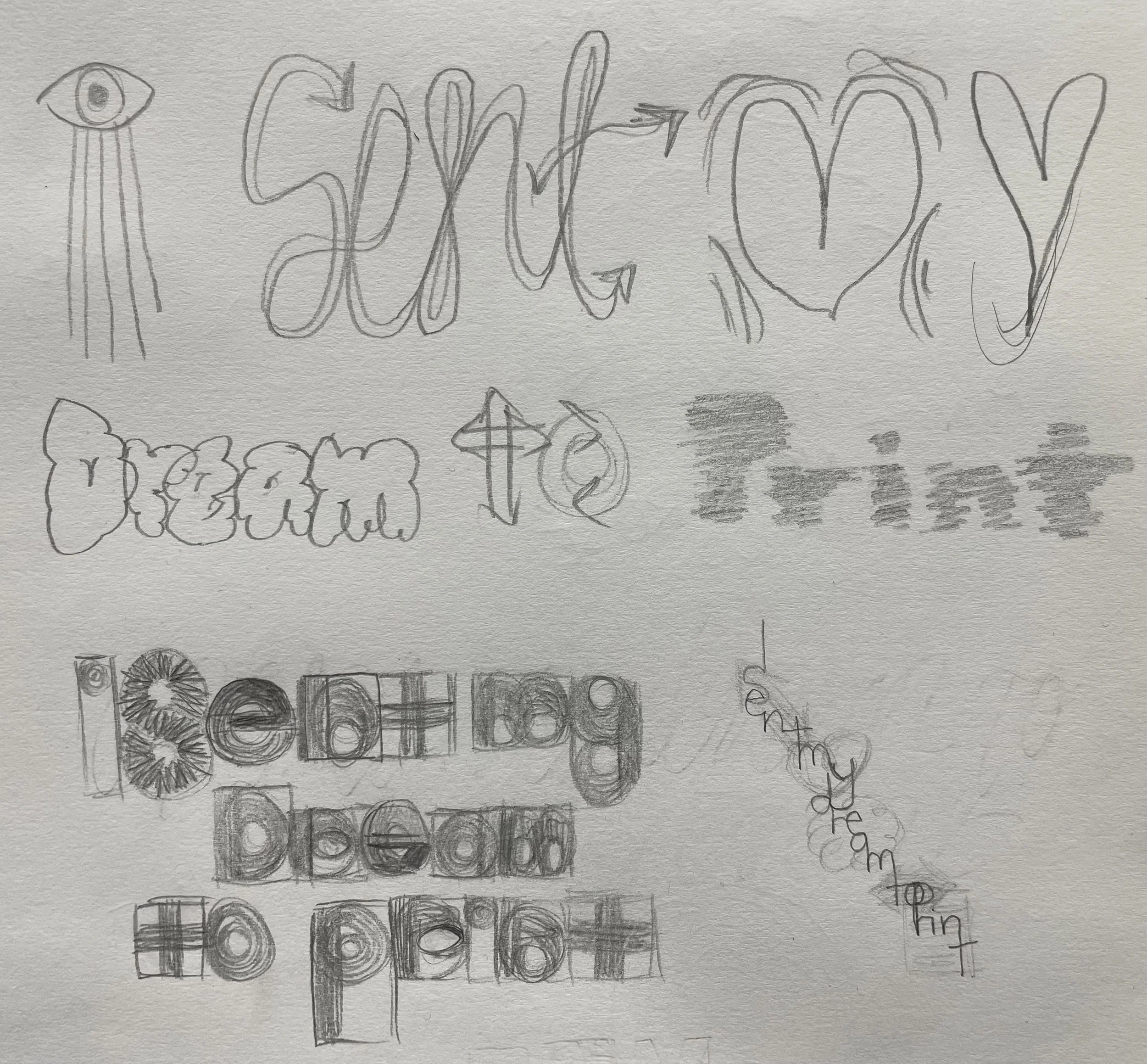
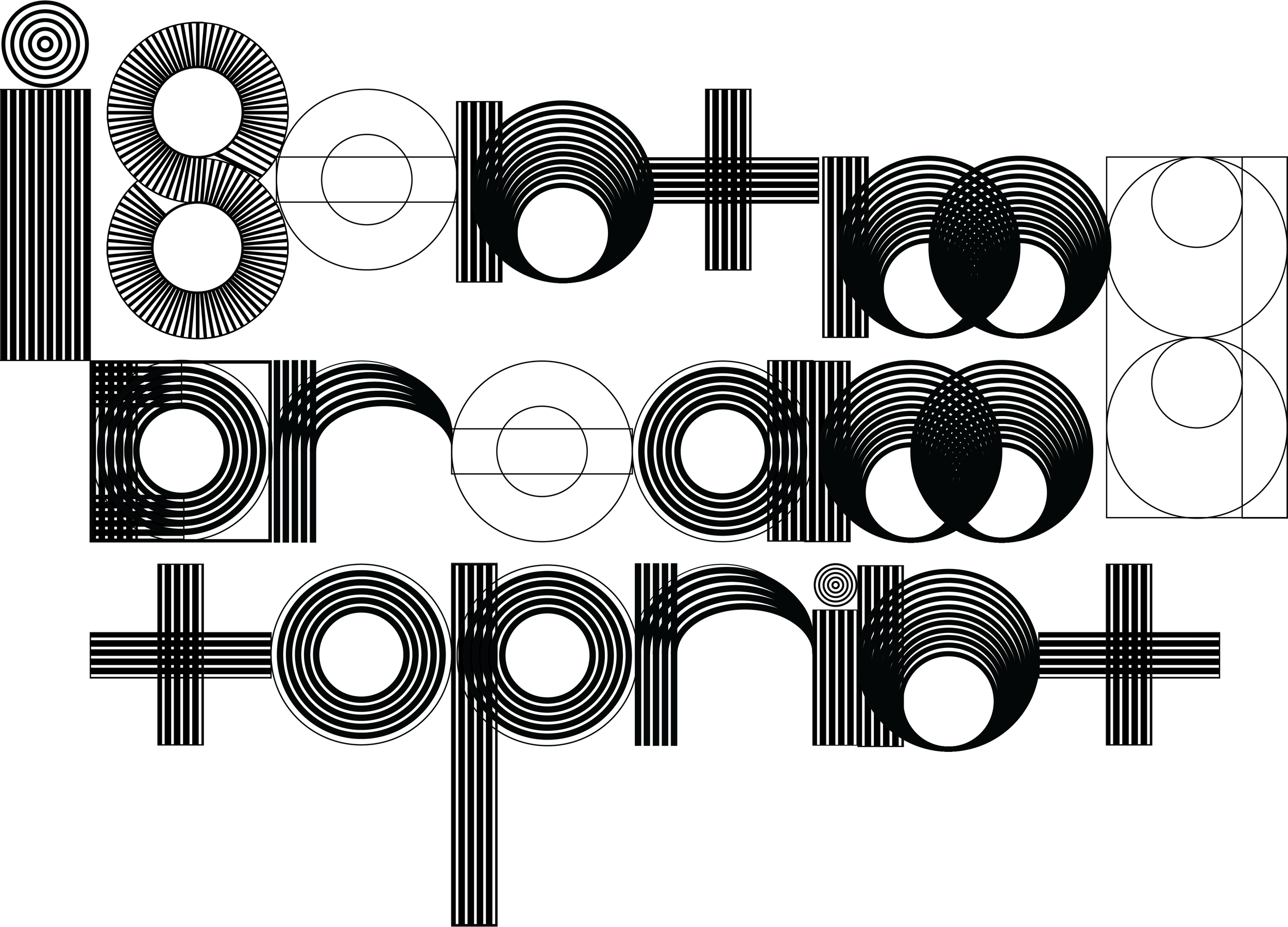
Initially with a lack of inspiration, the original concepts were abstract typography graphics of the color book title, but none of the trials seemed to be effective enough as illustrations. Japanese typefaces are more unfamiliar and seem more artistic in form, and the simplicity of just ‘dream’ written as single characters rather than as a sentence that is a title allows more focus on the illustrative aspects of it.


